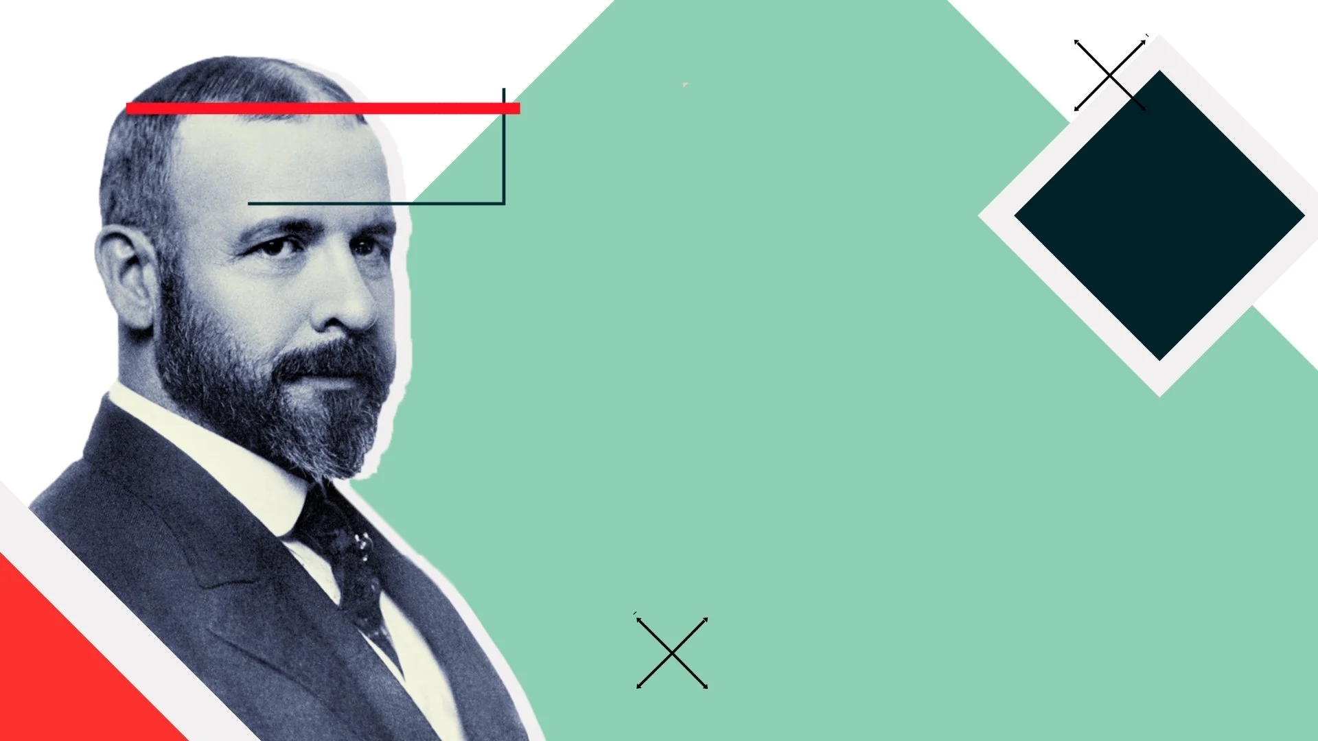
Brand Identity · Visual Systems
Grovo Learning Content
A content system built to stay coherent at any scale.
Role
Art Direction & Designer
Client
Cornerstone OnDemand
Recognition
Overview
Grovo Learning was already running when I came onto it. An established visual system, multiple content categories, a high-volume production pipeline that had to keep moving while I figured out what needed to change.
My job wasn't to rebuild it. It was to refresh it, expand it, and make it better without breaking the continuity of everything that already existed. That's a different and more demanding problem than starting from scratch.
Approach
I came in and looked at the system the way you'd look at anything inherited: not to find what was wrong with it, but to understand what it was trying to do and where it wasn't doing it well enough.
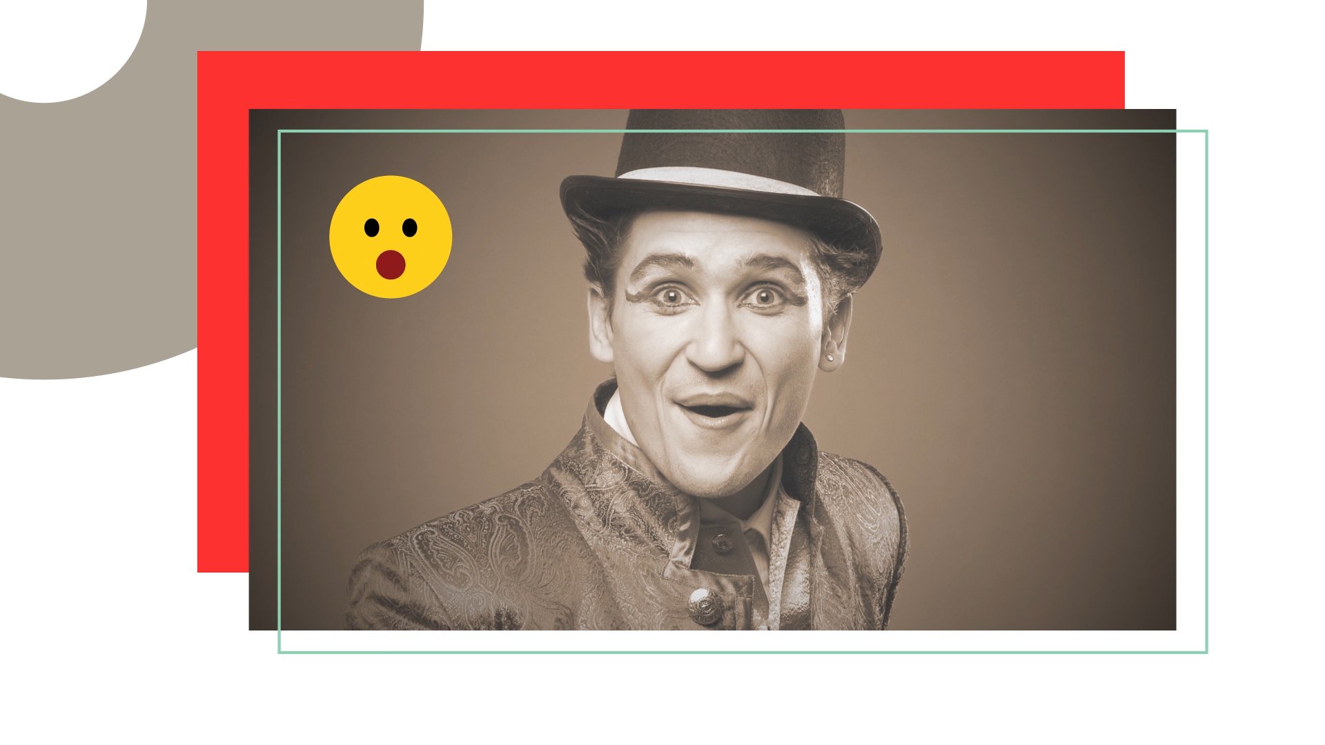
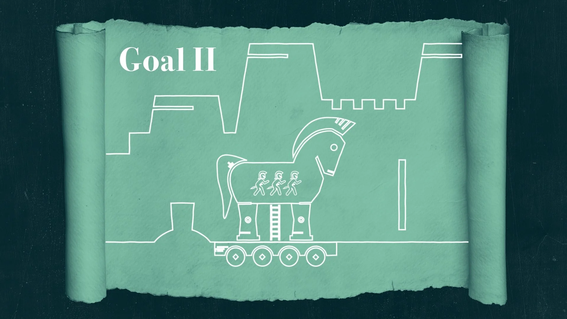
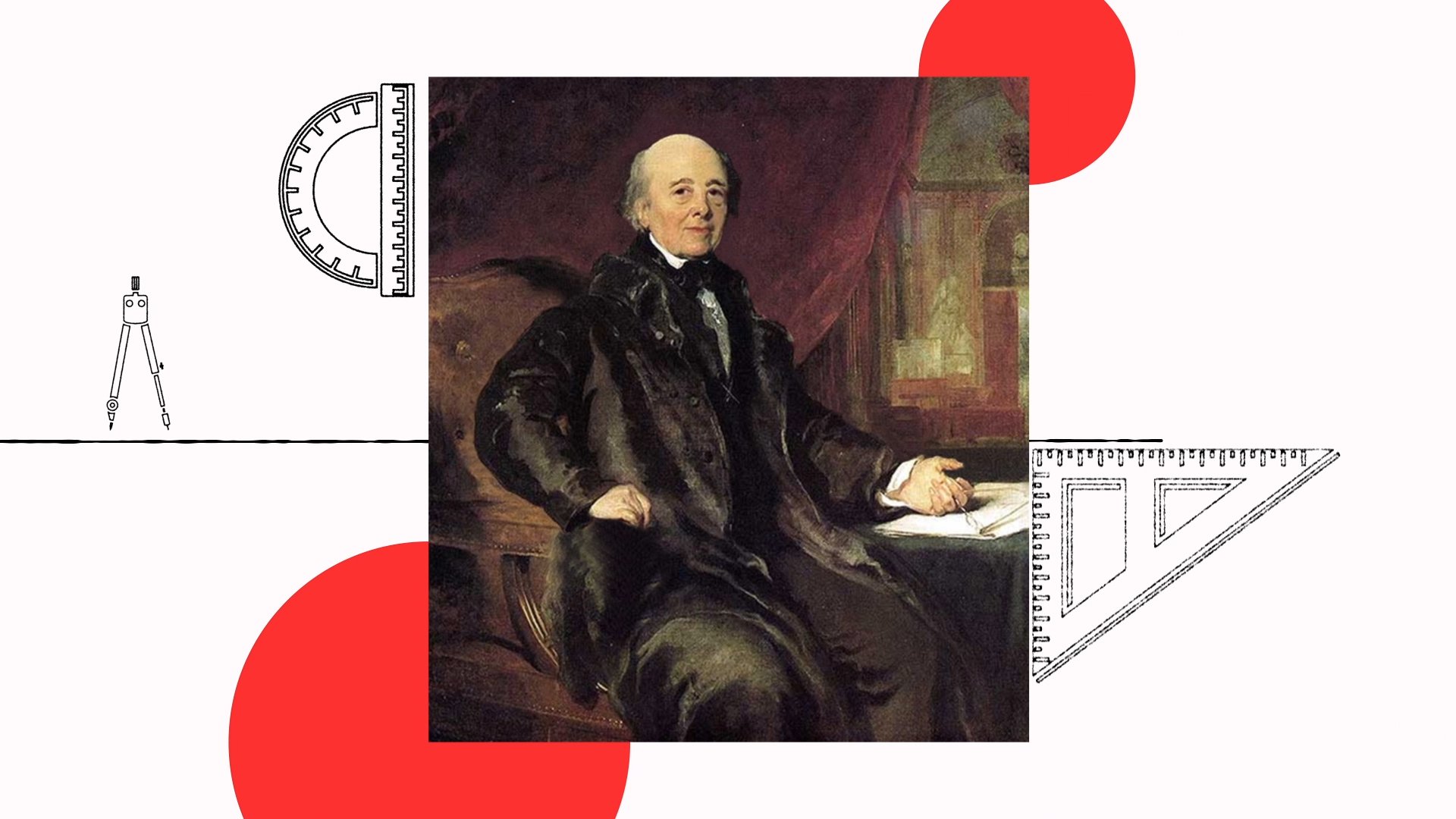
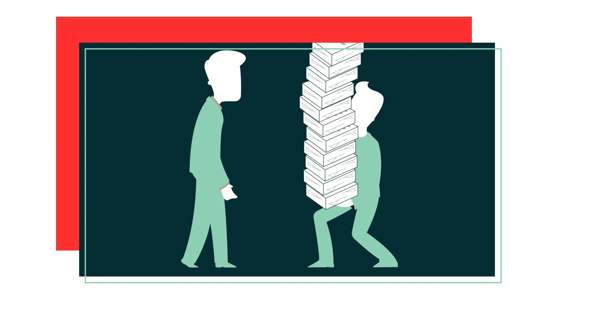
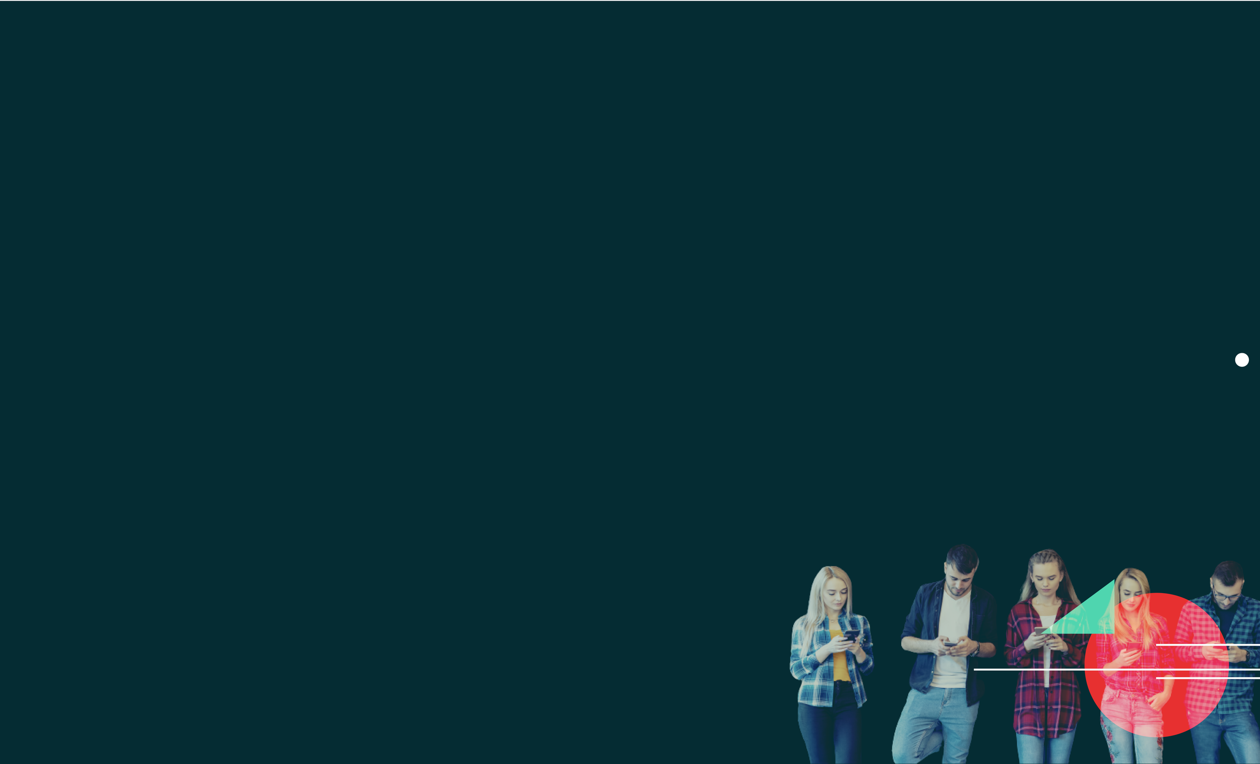
The refresh introduced new structure to how information appeared on screen. New infographic elements that made complex ideas faster to read. New transition logic that gave the system a consistent motion language across all categories. And design callbacks — visual markers that reappear at key moments to orient the viewer within the content, so they always know where they are in the idea being explained.
That last detail matters more than it sounds. In short-form learning content, a viewer can lose the thread of an idea in seconds. A well-placed visual marker doesn't just create consistency. It does navigational work inside a format that has no navigation. It keeps comprehension on track without interrupting it.
These additions ran consistently across every category in the library. Built into the system so every video that came after worked the same way.
Challenge
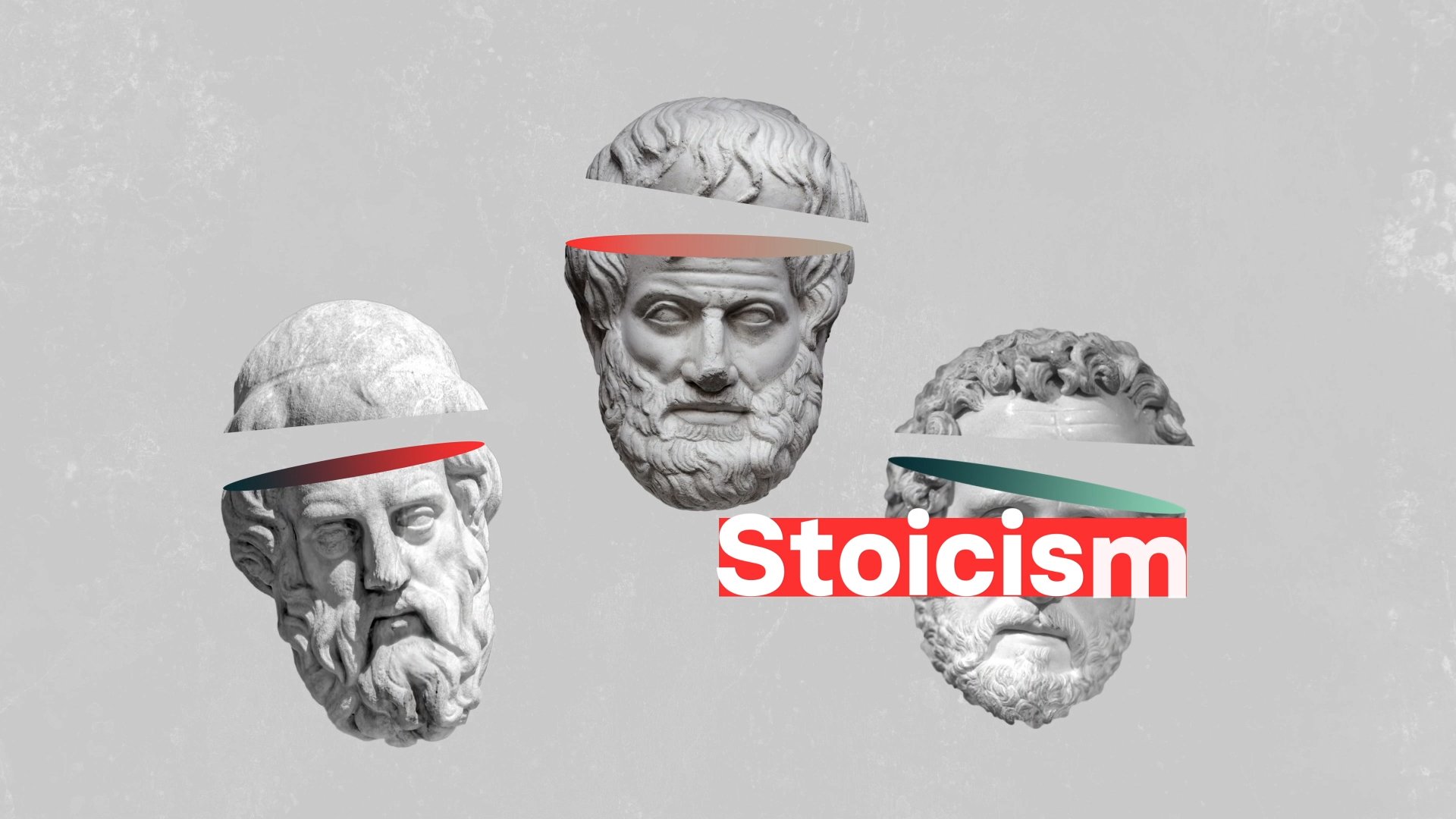
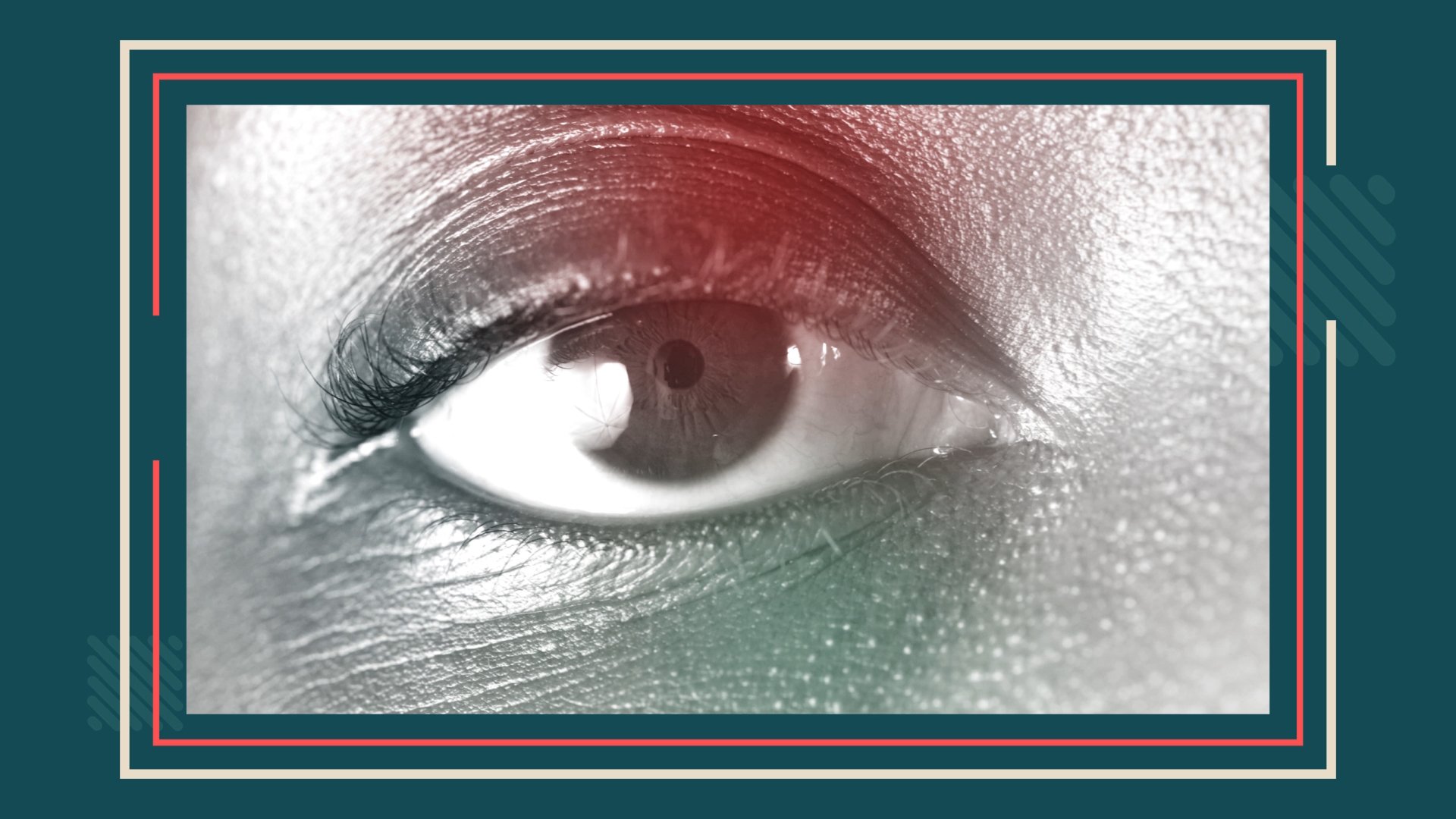
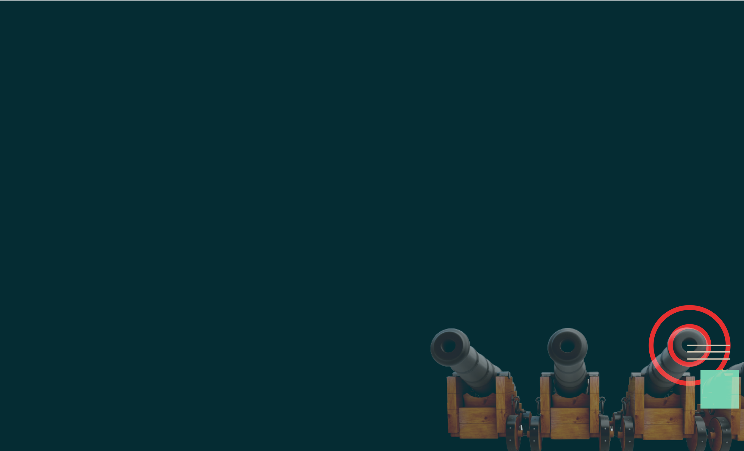
A library spanning multiple content categories — compliance, leadership, wellness, onboarding, and more — each one requiring a different emotional register while still reading as one unified system.
Compliance content can't feel the same as wellness content. The tone, the weight, the way information lands all need to shift. But the visual system has to hold across all of it or the library loses its identity.
The refresh had to introduce enough range to serve those different registers without introducing so much variation that the system fractured. That line is narrow and it moves depending on the content. Holding it across hundreds of videos over multiple years of production is the actual challenge. Not designing any single piece.
Outcome
A refreshed system that absorbed the new design language across every category without losing what made the original work. Hundreds of videos produced over multiple years, all visually coherent, all on time.
The design callbacks proved their value at scale. When a system element has to work on video two hundred the same way it worked on video one, and it does, that's not luck. That's the right decision made early and held consistently.
That's what a good refresh looks like: not a new system, but a better version of the one that already existed.
Silver Telly Award — Non-Broadcast Sustainability and Corporate Training, 2021