Brand Identity · Motion Design · Visual Systems ·
The Glossary
Short-form visuals designed to make complex terms easy to understand, fast.
Role
Art Direction & Designer
Client
Cornerstone OnDemand
Recognition
Overview
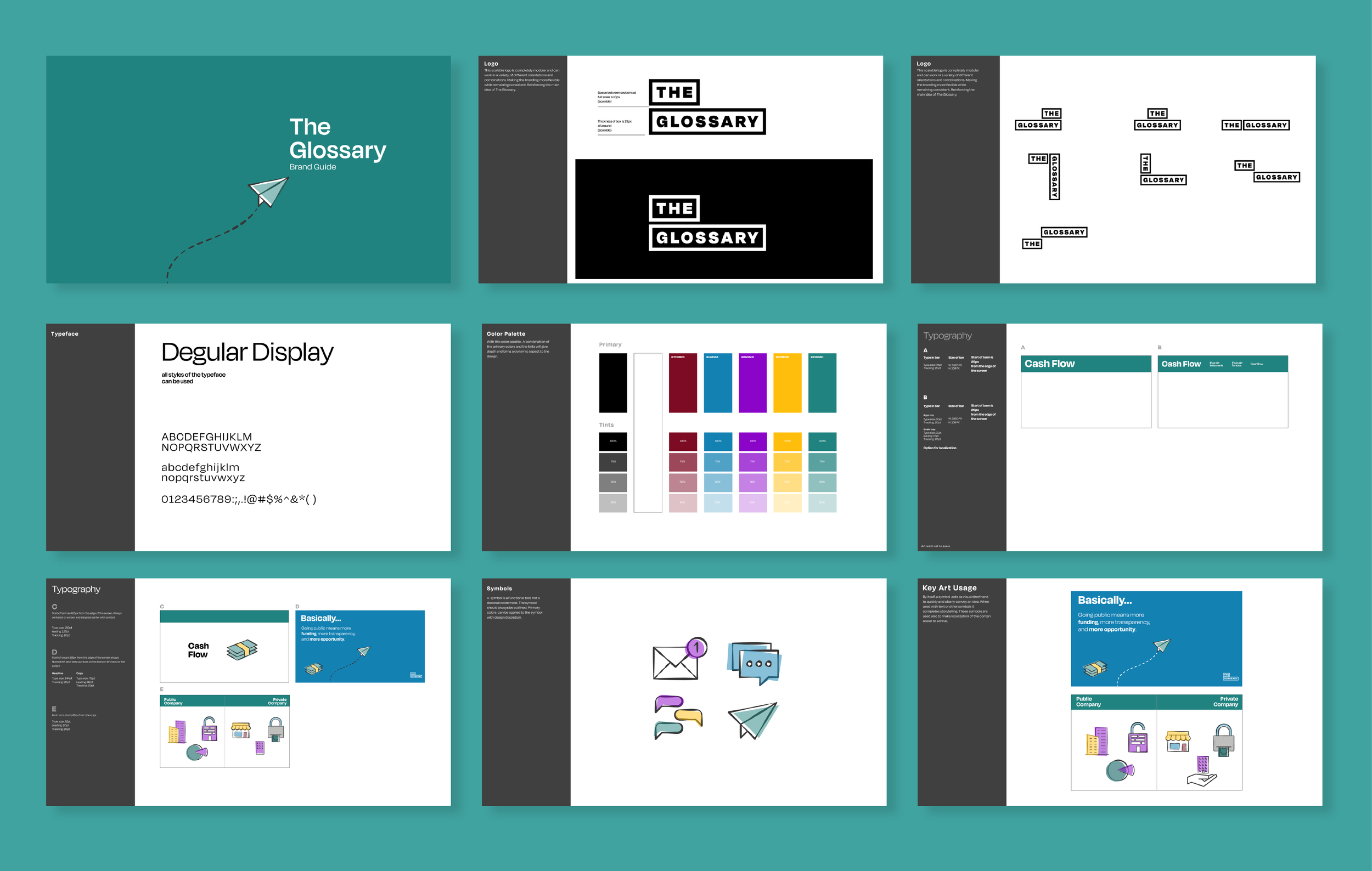
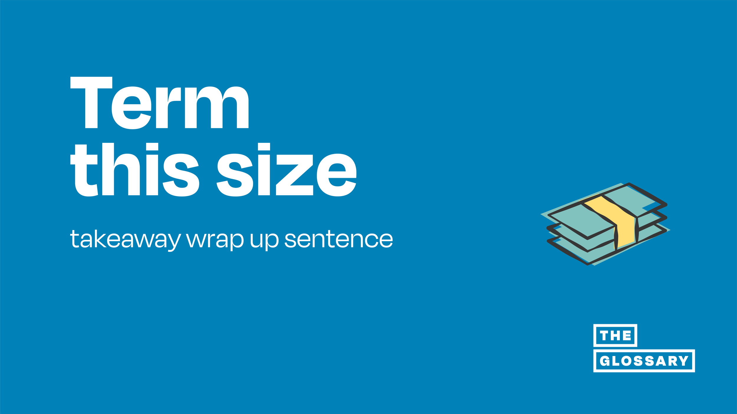
A series of short-form videos designed to explain common corporate and financial terms in under a minute.
Each piece focused on a single concept. The goal was to make complex language easier to understand through clear visuals that worked alongside the voiceover, not after it.
Approach
I focused on building a visual language that could simplify abstract ideas quickly.
The rule was simple. If a viewer had to stop and think about the visual, it was not working. Typography, motion, and illustration were used together to communicate the idea as early as possible.
The system was designed to be flexible enough to handle different topics while staying consistent from one video to the next.
Challenge
Each term had to stand on its own and make sense to someone with no prior context.
The difficulty was scale. There were over 40 terms across different subject areas, and each one needed to feel clear and distinct while still belonging to the same system.
Outcome
The result was a visual system that made complex terminology easier to understand without losing credibility.
It scaled across the full set of videos and held together visually, even as the subject matter shifted.
Silver Telly Award — Non-Broadcast Sustainability and Corporate Training, 2021