Brand Identity · Visual Systems
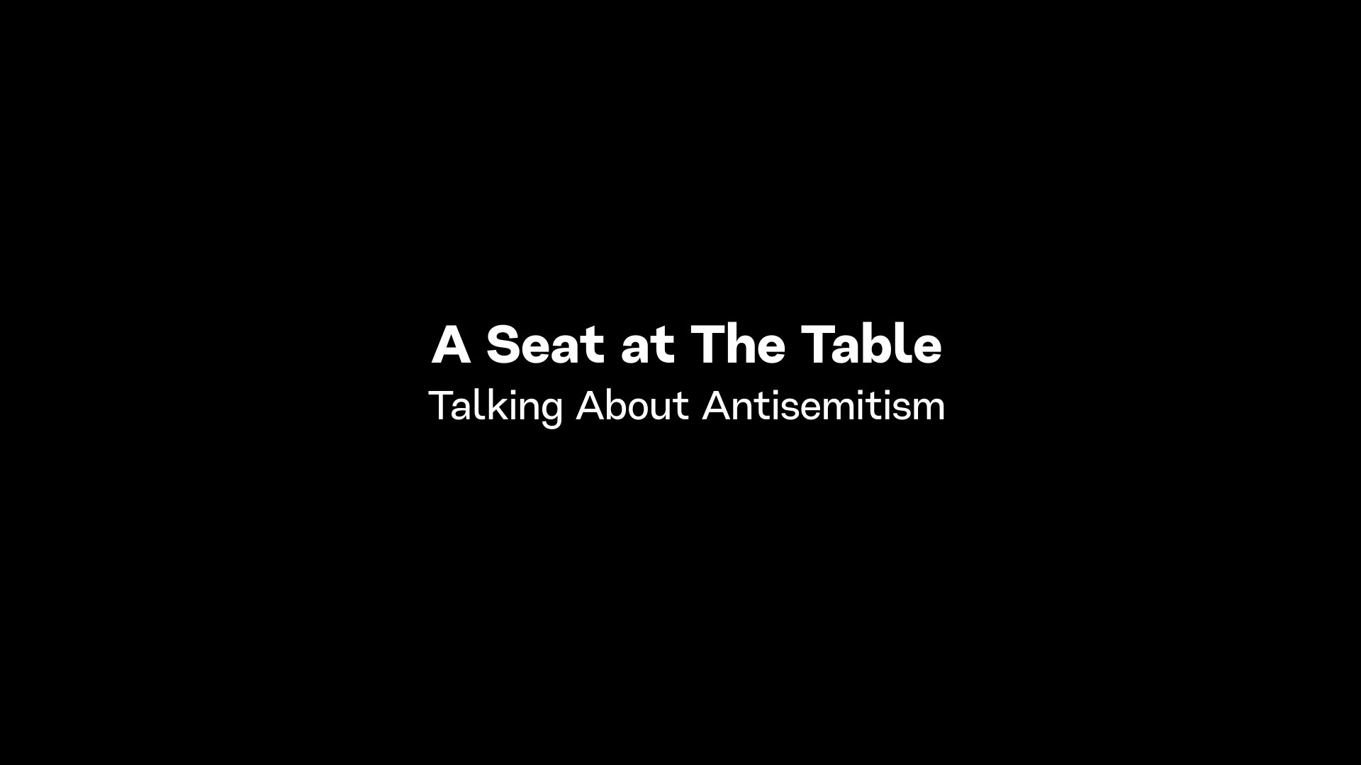
A seat at the table
When the content is this human, the design has one job: stay out of the way.
Role
Art Direction & Designer
Client
Cornerstone OnDemand
Recognition
Overview
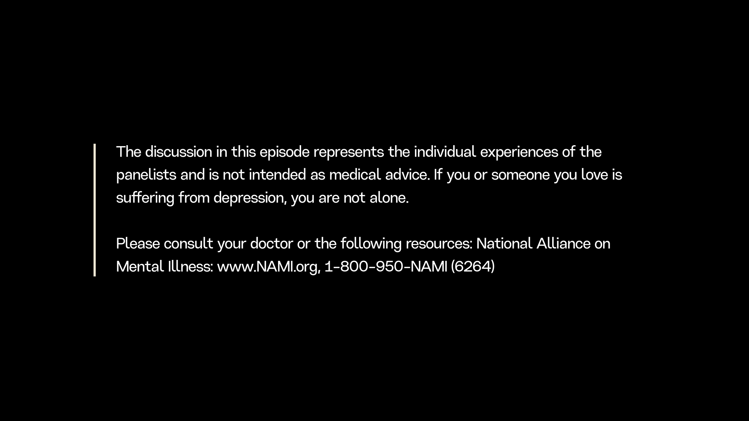
A documentary-style series built around real conversations about diversity, equity, inclusion, and belonging in the workplace.
Real people. Real experiences. Real stakes.
That changes the design brief entirely.
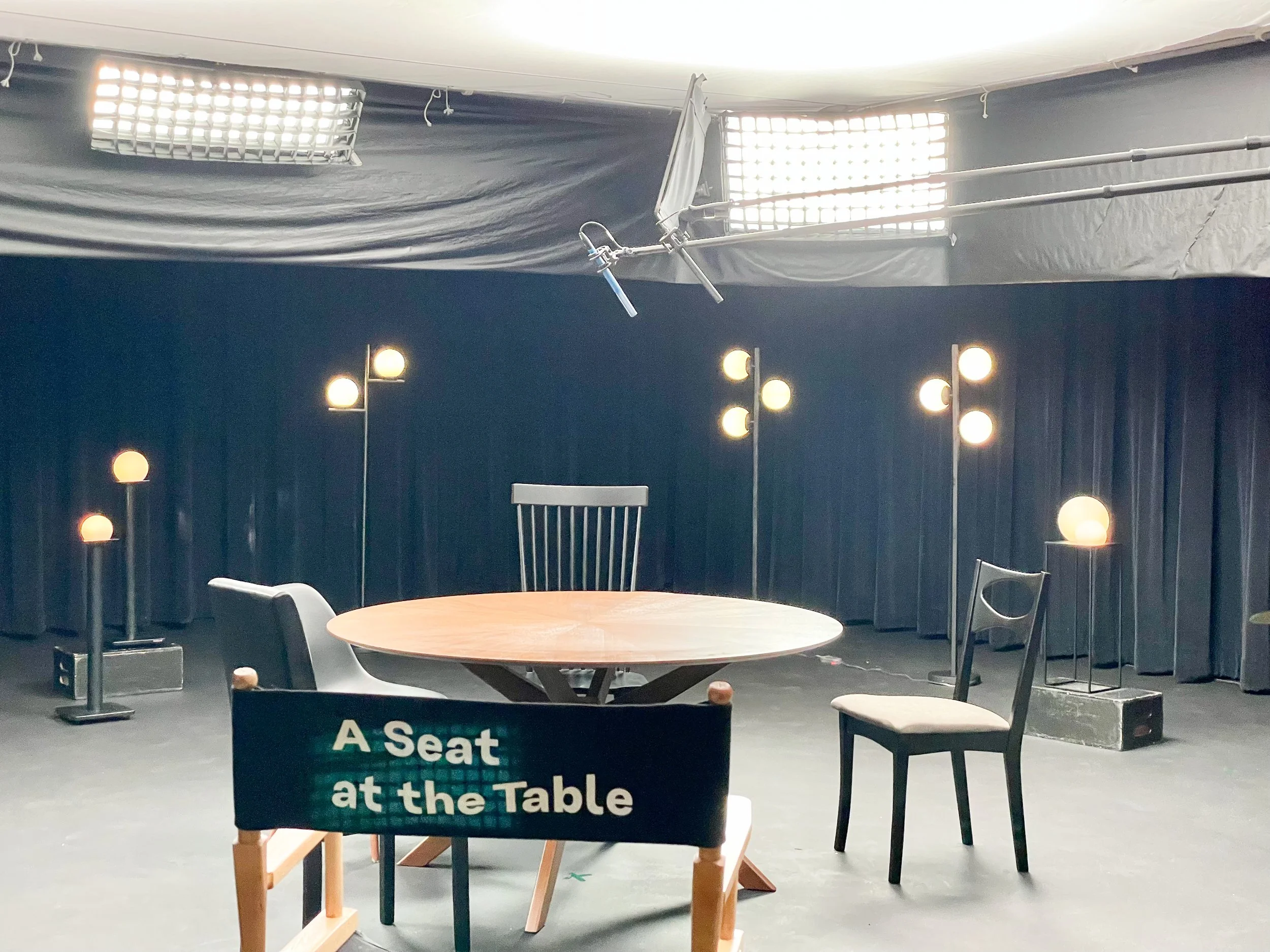
A Seat at the Table came to me as a concept document, a mood board, and some rough design ideas. About 40% of the way to something. My job was to take it the rest of the way. Sixteen episodes across two years. A Gold and a Silver Telly at the end of it.
Approach
The first thing I did was reduce.
The original direction had more in it than the content needed. More visual complexity, more design presence, more of everything. That's the easy mistake on a series like this. Heavy design creates the appearance of production value while quietly working against the reason someone is watching in the first place.
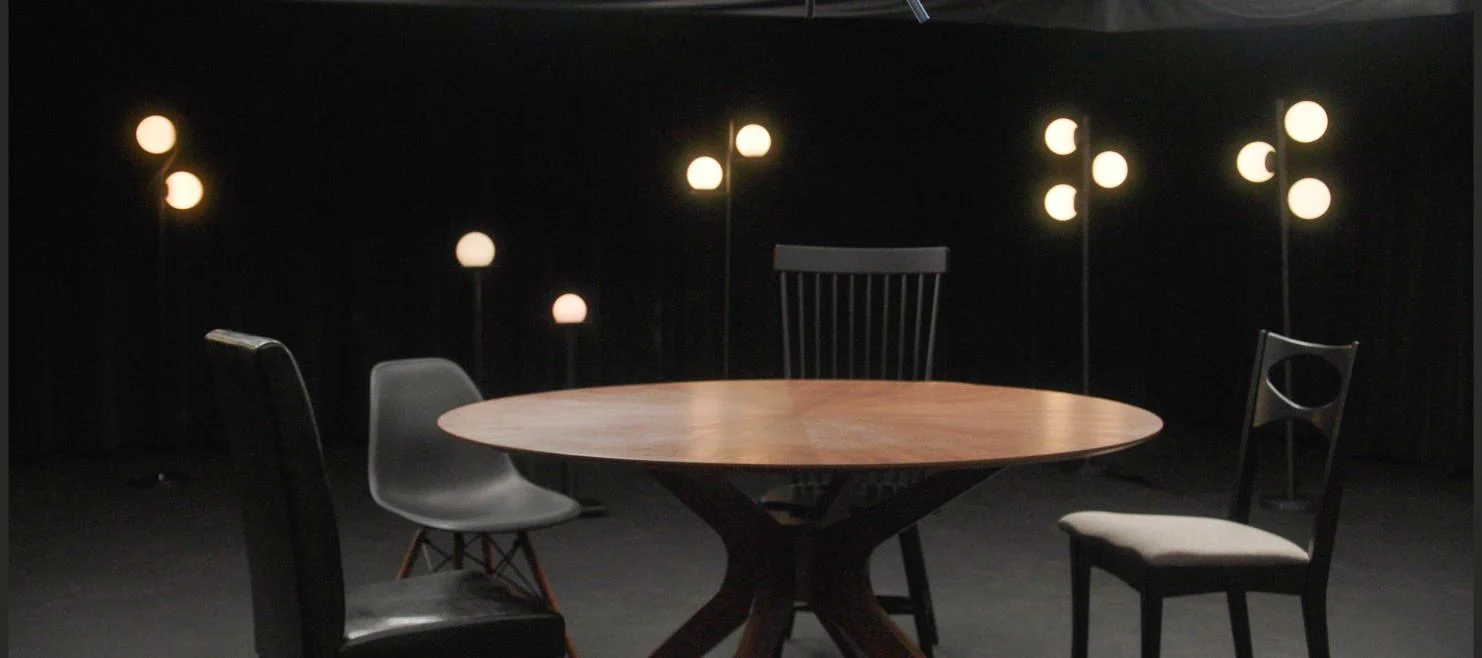
I pulled it back. Stripped out what was competing with the people on screen and made what remained more considered, more on brand, more deliberate. Color, typography, and composition used carefully. Every element earning its place by supporting the conversation, not decorating it.
The rule was simple: the people on screen carry the weight. The design holds the frame.
That standard applied across all 16 episodes and every supporting asset, so the tone stayed consistent from the first frame of episode one to the last frame of episode sixteen.
Challenge
The subject matter required a specific kind of precision.
The design couldn't feel polished in a way that made the content feel produced. It needed to be present enough to feel intentional and restrained enough to feel honest. Those two things pull in opposite directions and the line between them moves depending on the moment.
Maintaining that balance across two years of production, across 16 episodes, across every supporting asset, meant making the same disciplined call over and over again. The temptation to add is always there. Knowing when not to is the harder skill.
Outcome
Sixteen episodes. Two years. A visual system that held together across all of it without once pulling focus from the people it was built to serve.
Gold Telly and Silver Telly, both 2022, both in the Diversity, Equity, Inclusion & Belonging category.
The best feedback a design system can get on content like this is that nobody talked about the design. They talked about the conversations. That's exactly what was supposed to happen.
Gold Telly Award — Diversity, Equity, Inclusion and Belonging
Silver Telly Award — Diversity, Equity, Inclusion and Belonging