Brand Identity · Visual Systems · Illustration
The Glossary
100+ terms. Under a minute each. No prior knowledge required.
Role
Art Direction & Designer
Client
Cornerstone OnDemand
Recognition
Overview
Think about how airport signage works.
No words. No prior context. No assumption about what language you speak. Just icons reduced to their most essential form, and you know exactly where to go. That's not a design trick. That's a system built on a single principle: recognition beats explanation every time.
That principle became the foundation for The Glossary, but it didn't come from a brief. It came from research.
I studied how content systems handle explanation — what worked, what didn't, where the gap was. Then I built the concept, the visual language, and the entire production infrastructure from scratch. One hundred short-form videos, each one taking a single term and making it completely clear in under 60 seconds. It started with financial terminology and expanded all the way to AI, because it was designed from day one to handle any topic, not just the ones we started with.
Approach
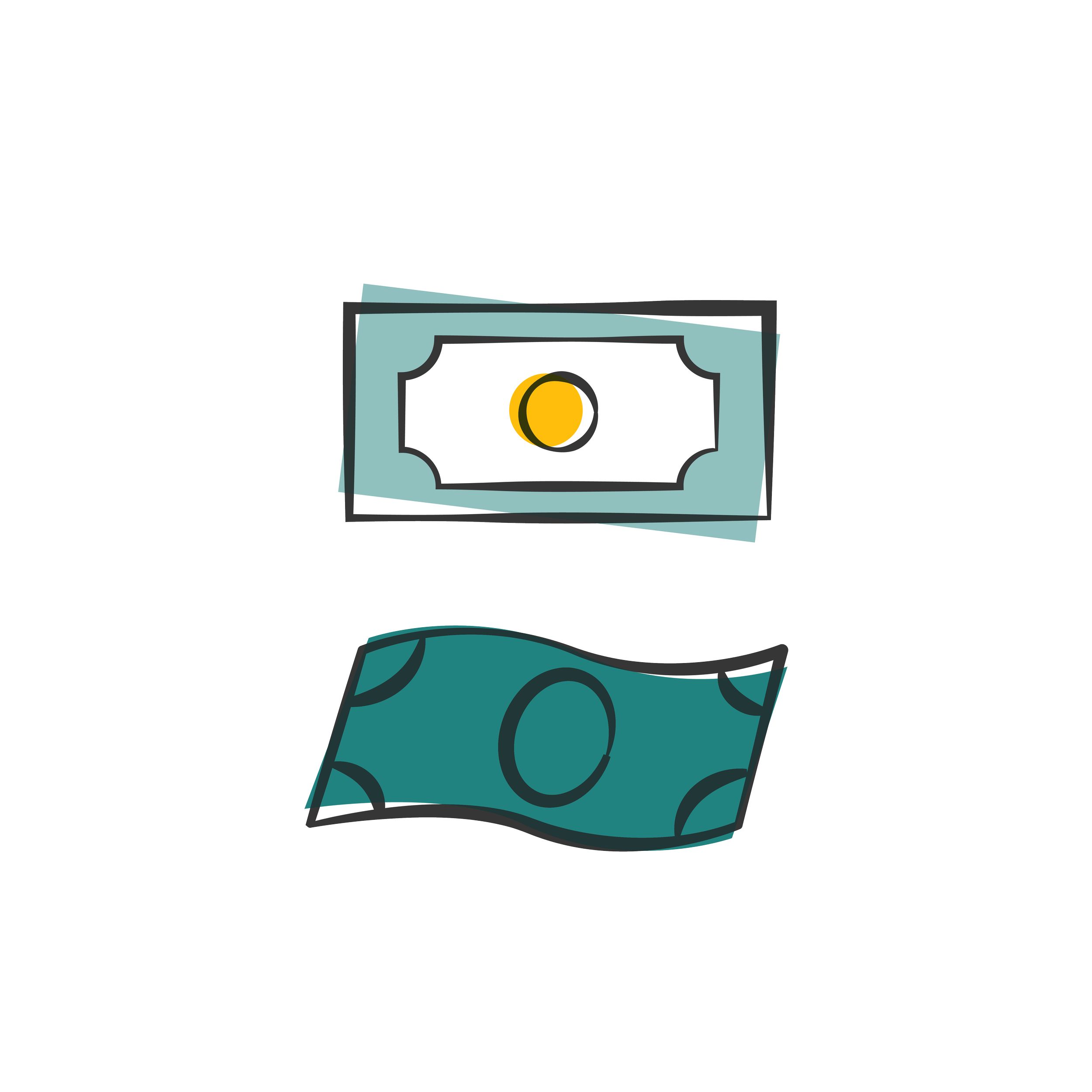
The system is built on a custom illustration library I designed from the ground up. Icons developed specifically to translate abstract concepts into immediate visual form. Not decorative illustration. Functional illustration. Every icon exists to close the gap between a term and the idea it represents.
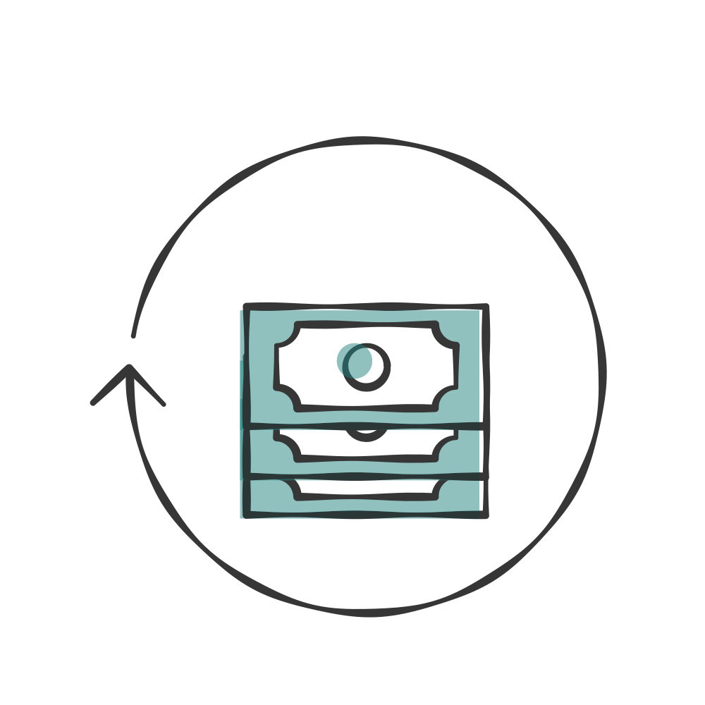
For a term like "earnings," abstract financial language becomes physical and tangible: currency, buildings, the actual mechanics of how money moves into a company. The viewer understands before the voiceover finishes the sentence.
When concepts connect or evolve into each other, icons transform. One form morphs into another to make the relationship between ideas visible rather than just described. That technique wasn't applied to every video. It was used selectively, only when the connection between ideas was the point. Knowing when to use it was as important as knowing how.
The motion language is different from DNA. More concentrated, more icon-driven, built entirely around the moment of comprehension. Every animation exists to make the idea land faster. If it wasn't doing that work, it wasn't in the video.
I ran the production end to end: overseeing reviews, maintaining quality control, and making sure every video that came out of the system met the same standard as the one before it.
Challenge
One hundred terms across completely different subject areas: finance, leadership, compliance, artificial intelligence. Each one needed to stand alone and make sense to someone arriving with no prior context.
The difficulty wasn't designing individual pieces. It was building a system flexible enough to absorb any topic without requiring a new visual direction every time. Financial concepts have obvious visual forms. AI terminology doesn't. The system had to stretch from one end of that spectrum to the other without breaking.
Building the illustration library meant anticipating that range before the content existed. Designing a visual vocabulary broad enough to handle anything the series would eventually need to say.
Outcome
One hundred videos. One visual system. One illustration library that made all of it possible.
The Glossary expanded from financial terms to AI terminology without a single directional reset, because the system was built to grow, not just to cover what we knew was coming. When new topics arrived, the language already knew how to handle them.
The research that started it proved out at scale. A system conceived around one principle — recognition beats explanation — held across a hundred different subjects, a hundred different concepts, a hundred different moments where the visual either did its job or it didn't.
It did its job.
Silver Telly — Non-Broadcast Sustainability & Corporate Training, 2021